Friday, August 31, 2007

Trading System Update

Still working on my system using Amibroker. Here are a few things that I've tried, the work continues.

  • I've incorporated Heiken Ashi charts for visual representation of trends.
  • I'm now using a plug in dll for stops. It's called REM, and it's available on the yahoo Amibroker groups.
  • I'm using FOREX data to test with since there are hardly any gaps. The downfall is that there is also no volume info available. But since I'm not using any volume related indicators, it's OK.
  • Trying to incorporate the IB Controller plug in. It allows the buy & sell signals generated within Amibroker to transmit order to Interactive Brokers TWS application for placing orders. Wave files can also be triggered to tell you what is going on without watching the screen. It's not quite there yet. I'm using the paper trading account to test this functionality.
  • I have incorporated signals from a Zero Lag indicator. It give similar signals compared to Stochastic but a bit earlier. I got this indy from Amibrokerfan.com. Mike, the admin, uses 5 indy's and Heiken Ashi charts for trading the emini. His system looks like it works but he doesn't advertise his loosing trades too much so who really knows.
  • I continue to struggle with finding something that can do better than 5 to 10% CAR (compound annual return) . This may be some setting in my code to do with positioning size or something so I'll have to examine that.

The struggle continues. Overall, this is harder than I thought it would be. Hopefully I'll have something in a week or two.

Bye Bye Chat

The chat window has been removed.

Thursday, August 23, 2007

Chat

We have added a chat window on the left side of the blog. We welcome any suggestions for blog topics, or reviews of stocks, or sectors. I know "The Word" would like to have reader comments on his take of the market, or rather, what he "sees" in the charts.

If you have any experience or questions on trading systems, this is a great to place to discuss, much easier than opening comment windows.

I have seen some blogs with chats for day traders, to pass along stocks that are setting up or have begun a move. We welcome day traders to post through out the day.

Sunday, August 19, 2007

The Canadian market – Week in Review 32.

This week the TSX Composite broke through the 200 day moving average (13,327.04), then the March low of 12,661 and bounced back from 12,500 establishing a column of X which for now is a short term uptrend. I still don’t expect much from this bounce as there will be numerous resistance levels where supply will manifest itself, again.

-1- The first area of congestion will be the previous support at 13,250 (green rectangle) because broken support usually becomes resistance.

-2- For the short term trend to truly reverse itself, the market needs to break resistance at 13,650 (blue rectangle)

-3- The most likely scenario however would be the completion of an end of bull market distribution pattern called a head and shoulder, where the current rally would the formation of the right shoulder with a top in the area of 13,400 (purple square). The formation that I see here has been identified by the 3 purple arrows and the neckline would be at 12,500. I still believe we are now in a bear market. This long term trend will remain until the red bear downtrend line is broken (14,050 currently).


I always have to remind myself that “the trend is my friend”. There is a temptation to trade the short term bounces. However, I suspect the bear will wake up in the 13.250-13,400 region providing them with the last chance to short this market…

The TSE Bullish % is now valued at 36.94%, compared to a reading of 47.01% last week. This is bear market territory. For now, the bounce was not strong enough to change the bearish condition of most stocks in the index.


We present below, an evaluation of all the sectors of the Canadian market. The significant events are:

-1- Seven sectors had breakdowns as shown in the Last Event column compared to three last week. Metals and Mining and Energy moved from a bull to a bear trend joining Income Trusts and Healthcare.
-2- The bounce was lead by Metals and Mining, Energy, Finance and Materials (all are in a column of X).


An investment in the Gold iUnits provided a -10.5% return this week illustrating that investing in precious metal stocks was no protection at all.

The big event of the week was the breakdown of large cap stocks in Canada. The TSX 60 is now also in a confirmed bear market as show below.


The breakdown is shown by the red square at 735. We did get the bounce of the support level of 725 but for now the previous support (purple rectangle at 765) appears to be a good resistance level as the market closed below that level Friday. Another Head and Shoulder pattern may be forming here as well with a neckline at 725.

There is no question that the Canadian markets are severely oversold, even after the recent rally. The legitimate question is what would convince me that this is a correction and not the beginning of a long term bear market. The answer lies in two indicators that are used side by side to confirm any short term uptrend.

The first indicator evaluates the number of stocks which are trading below their 50 day moving average. Currently 7.45% of the stocks are. There would have to be a breakout above the 30% resistance level (blue arrow) to confirm that the current bounce is more than a bounce.


The other indicator which is used in conjunction (both indicators must confirm each other) with the 50 day moving average indicator is the High/Low indicator below:


It is clear that this indicator confirms the washed out condition of the market since 93% of the stocks are making new lows. A breakout above the 10% new highs resistance level (blue arrow) would be a good short term buying opportunity.

In conclusion, the bulk of the evidence still favors the bears. The Feds handling of the liquidity crisis demonstrates to me how inexperienced Ben Bernanke has been in handling what may prove as a major economic event. He finally reacted to the pressure he received from his friends in the financial community. This may be a case of too little too late however. This week coming will be another lazy summer doldrums week!

The Word
therealword@gmail.com

Saturday, August 18, 2007

First kick at the can

I've been working on a mechanical trading system, using amibroker and IO for back testing. I think I have a good handle on amibrokers programming language, I'm a self taught programmer with my start in basic, fortran and a few years ago, perl. Since it is so easy to add new indicators and buy / sell conditions, I find myself testing ideas quickly. To weed out good from bad ideas I look for two things, CAR and % winners. I look at these results for a small handful of symbols, to see what changed with my tweak. Well, I've gone almost full circle, deleting allot of the tweaks in the past few days.

Here is where I'm at. The chart shows green BUY arrows, and red SELL arrows, long positions only for now. There is also a channel shown. This is a 13 day MA of the highs and lows that clearly shows when the stock is trending, of course only after the trend has started. The Blue line is the stop.
Now, we all know that beck testing doesn't guarantee future results, but either does guessing, right! Software makes it easy for us to invent systems, test, tweak, modify... The system needs more work in terms of the results it spits out on the screen. I'll be running some more back tests once I have the stops worked out, looking to maximise CAR, minimise loser, and get the Sharpe ratio up there. More on this later.
To the naked eye, this system looks like it is coming along just fine. What happens during sideways action? This...I'll be attempting to fix this by killing buy signals as soon as the sideways is detected. More accurately, I have tried several things but I'm not satisfied yet. Perhaps a trade delay if Buy/Sell signals are too close together? The work continues..... But more importantly, I want to improve the stops. Looking at the chart, I know what I would do, by experience, judging how I have positioned stops in the past. I'd like to program the back tester to do some things that would give me a more accurate picture of what the capabilities of this system are.
The next step will be to turn off the BUY and SELL signals and turn ON the SHORT and COVER signals, separately. Then, all the signals will be turned on the see if we have any interference issues.

I am focusing on a basket of stocks for now. Next, I'll test by price and volume, screening for liquid stocks probably more than 2 dollars. I'm not worried about exiting in terms of liquidity, I just don't like the choppiness of these types of stocks that trade under 100K per day.

The last part of this system will be to look at the markets for clues, to switch the BUY and SHORT signals ON and OFF.

In building any complex system, it is best to test all the small components of the sub-system separately first (Buy and Sell). Then test them as a whole system (Buy, Sell, Short, Cover). Then test that system together with other systems (markets, QQQQ, SPY, SPTSE, etc).

Friday, August 17, 2007

Get me out at any price

Yesterday, we experienced a wild ride in a roller coaster. The damage was significant. The stocks that I follow (Canadian stocks, US stocks, and ETFs) as a group experienced the worst Point and Figure chart day since the last bear market. 80% of these stocks experienced a major breakdown of some nature with about ½ breaking their long term uptrend.
When one looks at the TSX 60 index (please look at chart below), which is a portfolio of the largest most liquid Canadian stocks available, using the traditional technical tools nothing really seems to have happened. The bull market uptrend line has not been violated so this must be a correction right? The 200 day moving average has been violated (MA 10 months) but that happened before in this bull market (blue arrows).


I suspect that what really happened is that a majority of institutions investment committees have now decided that we are in a bear market and they now want to get out at any price. Those following my analysis have known that for awhile now. Institutions have a very long term perspective on investing, and they need a lot of confirmation before they make a significant move. Being fundamentalists for the most part, I believe their economists and analysts have now turned bearish on the impact of this liquidity crisis. The retail investor was not there this time to pick up the stocks they were distributing so now they are dumping… I once was part of these investment committees so I know how it works…!

The S&P TSX 60 actually broke its long term uptrend line yesterday (O in a red square) as shown by the following chart. For institutions, that’s catastrophic:


During the day, the index bounced off the significant support at 725 and closed back up right on the uptrend line at 744.18. I will go on a limp and say that it’s too late. The technical damage has been done. Watch out below. If you are a retail investor, don’t try to bottom pick because I fear it’s going to get uglier, hear me Betty.

The other significant event yesterday was that the TSX Bullish % (gold line) as shown on the next chart broke a significant multi year support (purple line with 2 purple arrows are the support and the red arrow is the breakdown) and there now is a good probability that we are going down to the 30% oversold level (green line). We just need to be patient.


I will have more to say on market conditions in the next edition of the “Canadian market – Week in Review”. The best recommendation I can make right now is to get rid of your emotions, keep a cool head, and resist the temptation to buy anything you might consider cheap right now. It might get actually a lot cheaper as the madness of crowds sets in.

The Word
Therealword@gmail.com

Thursday, August 16, 2007

Hedging – Now available in Canada

Hedging consist in protecting your portfolio by purchasing an asset which will be negatively correlated with your portfolio. Negatively correlated means that, when your portfolio goes up, the offsetting asset will go down and inversely. Up until recently, the only way to hedge was using options. For investors, it can get complicated and the leverage can be frightening. Horizon recently started offering a Bear ETF on the TSX60 index which for every 1% downside move on the index, theoretically the upside on the ETF should be 2%.

Lets suppose I am an retired investor needing income to live needing to protect myself against a market downturn. I own a diversified portfolio of income trusts yielding around 8%. My total portfolio is worth $200,000 and I am currently invested $100,000 in income trust and scared so I have accumulated $100,000 in cash yielding another 4.5% or so. I want to protect this income. What shall I do? Perhaps I should buy some Horizon BetaPro S&P/TSX 60 Bear Plus (HXD.TO) which if my portfolio goes down will rise and compensate for the capital loss.

The chart below uses the Barclay’s iUnits Income Trust Sector index Fund (XTR.TO) as a proxy for my portfolio and compares that to the HXD.TO from July 16, 2007 to last night. The Income Trust units (blue line) have been falling with the market while the Bear Plus fund has been going the opposite way.


Given that HXD is supposed to rise twice as much as the fall of the market, I would expect that buying ½ my portfolio’s worth or $50,000 would compensate for the portfolio’s capital loss. The chart below illustrates that scenario.


It also shows that for most of the time, I would have been losing money as I would be a winner only during the past 2 days earning a total capital gain return of $4,000 or 8% on the $50,000.

If you want to be a purist, you could calculate the exact amount that would have been needed to offset the long position in Income Trusts. That would be $36,000 for a $0 capital gain. That must mean that the income trust sector is not falling as fast as the market.


Since $36,000 is the zero capital gains amount for the period, any amount above $36,000 should be considered as a bear bet on the market. Using $50,000, we would actually have a $14,000 bet against the market.

Finally, what would have happened if we were very good at “market timing”. Then we would not have purchased the HXD.TO on July 16, 2007 but on July 23rd instead. The $50,000 HXD.TO bet would have provided a $11,000 capital gain or 22% on the $50,000.


If all investments were held for a period of one year, the total return on the $200,000 would be:

Income Trust Income ($100,000) $08,000
Cash Income ($50,000) $02,250
Hedged portfolio Capital Gain ($50,000) $11,000

Total Return $21,250 or 10.62%

Not bad for a very defensive strategy in a DOWN market.

The Word
Therealword@gmail.com

Wednesday, August 15, 2007

Nowhere to hide

I worked in the finance business world for 35 years. One of the fallacies that I heard, and that I am still reading these days, is that one should buy precious metal stocks as a hedge to the dramatic downtrend world markets are going through.

The real truth is when the market goes down, everything goes down. That’s because, if the economic activity slows down, gold companies will be impacted just as much as any other sector of the economy.

XGD is an iUnit which is a portfolio of Canadian gold stocks. Does anybody remember when this portfolio reached a top of $86.50 December 5, 2006? It has been in a downtrend (red line) since then. How many times does one have to be alerted to exit when you are in a downtrend? There have been 5 such signals (red arrows) every time support was broken. There was a buy signal when resistance at $70 (blue horizontal line) was broken (blue arrow), and the ETF was severely shorted by the pros when it reached the downtrend line at $75 (open red arrow). It reversed to a column of “O” and it has been downhill since then. Nowhere to hide…


Yesterday, the US$ broke resistance at $81.09 and it looks to me that we now have a short term upswing as shown by the chart below:

In the meantime, XGD closed at support and appears to be in a short term descending triangle which is usually a bearish pattern.

What do you think might happen?
I for one would not put any of my money in Gold right now.

The Word
Therealword@gmail.com

Tuesday, August 14, 2007

Natural Gas is up 18.8% since August 6

The commodity broke short term resistance at $6.80 as shown below:


Technically, it appears to be the right shoulder of the multi year formation I discussed a few weeks ago.


The market is cautious however since the average realized price for the current quarter is much lower than that which was achieved during the 2nd quarter. Many pure natural gas stocks are stabilizing at lower support levels, but none have given a conclusive buy signal yet.

The preferred strategy might be to purchase diversified income trusts with some natural gas exposure and a good institutional following. Bonavista Energy (BNP.UN.TO) which has a mix of 55% gas, 30% oil and 15% heavy oil gave me a buy signal today

Full Disclosure: I own a position in BNP.UN.TO and my position can change anytime without notice.

The Word
Therealword@gmail.com

Sunday, August 12, 2007

Update on scans

I'm (Another Brian) back from a one week vacation. Thank you to "The Word" for the detailed posts and market insight provided for the TSX. It is interesting how the TSX does not track the US markets step for step.


I am in the process of back testing some of the scans that I have previously posted here on this blog. In addition, I am working on a system that I will be back testing, and posting results of the back test. I have been educating myself on the back testing process, it can be as complex as you want it to be. The first thing I noticed is the similarity to simulation. I have programmed discreet event simulation at work for material handling systems and I know that exactness is not that important. The idea of simulation is to have data input parameters somewhat accurate and the results will give you a great idea of the systems processing capabilities. If you can provide rough input, you can expect the output to be at least 80% accurate in simulation. I recently viewed a presentation on back testing that was very educational, and although the stock market is far from simulating material handing, there are allot of similarities. I am using Amibroker to do this.


Here is a link to the files for these presentations. The files include 2 presentations, power point files, and sample files. I recommend anyone who is back testing watch these two movies, even if you don't have Amibroker.
Presentation 101
Presentation 201

There is a free plug-in for Amibroker called IO. It is used to speed up the optimization process of your variables. The videos also discuss the results, the goal to set for results, what your goal should be based on (CAR, Sharpe, Ulcer, etc), the process of walk forward back testing, and tons of other good information.

For those of you interested in learning more about Amibroker, here are a couple of links. Yahoo also has a few groups.
Amibroker main site
Amibroker forum - a separate website, called amibrokerfan.com

I probably will not be posting regularly since I will be working on the system. Perhaps I will attempt to optimize the scans I have posted. I must first learn how to use this back tester and understand all of the information it provides on the output.

The Canadian market – Week in Review 31.

This week the TSX Composite broke the June and May lows and might just be on its way to the March low of 12,661. On its way there, my best guess is that we may see a bounce around the 13,150 area but because this support is based on a single “O”, I would not expect much from this bounce.

As mentioned this week, the long term uptrend line and the double bottom support at 13,500 were broken down this week, and that puts the market in a bear mode.


The TSE Bullish % is now valued at 47%, below my threshold of 47.5% and that confirms the bear trend and suggest that any bounce may be weak.


I see a lot of red on the map.

We present below, an evaluation of all the sectors of the Canadian market. The significant events are:

-1- Three sectors, Metals and Mining, Materials and Income Trust had breakdowns as shown in the Last Event column. Income Trusts moved from a bull to a bear trend in the process joining Healthcare which has been in a bear for awhile.
-2- Technology and Utilities are now in a column of “O” leaving Consumers Staple as the only sector bucking the trend.

We added this week a table in order to monitor the MidCap, SmallCap and Gold sector of the market. As you can see, the TSX Composite breakdown was accompanied by a similar long term uptrend line breakdown in Small Caps which is now also in a bear market.

A chart of the TSX MidCap index shows that we are very near the long term uptrend line on this index. What will this week bring?

Finally, the chart below shows the SmallCap index breakdown discussed above.

In conclusion, I hope this review of the Canadian market from a Point & Figure perspective will complement the information you typically use to make your on mind on the future course of the market. That is the objective.

The Word
therealword@gmail.com

Friday, August 10, 2007

Point and Figure Monitor – August 10, 2007

The main advantage of the Point and Figure methodology is that it clearly displays support and resistance levels. The most important signals come from breakouts and breakdowns from these levels and from breakouts and breakdowns from the bullish or bearish trend lines. In my experience, the most successful trades were initiated from these signals.

The following Canadian securities that I monitor had a change in their Point and Figure chart as of the close last night:


There are two breakouts, both from a long term downtrend line. This is a reversal of the main trend and merits investigation especially given the fact that relative strength is at the highest level of Buy in a column of X. Cdn Nat Resources and Sunopta.

The breakdown of the long term uptrend line for Encana might be a good short opportunity.


The star of the day for Income Trusts was Eveready following good financial results and guidance. It was up 17%, a very competitive return.

If there are any securities that you want me to include in my universe, please comment or e-mail me and I will try my best to do so…

The Word
Therealword@gmail.com

A tale of two markets– August 10, 2007

A tale of two markets– August 10, 2007

Did you notice that we have a divergence between the Dow and the TSE composite index? The TSE (in blue) has been going downhill continuously (lower highs and lower lows) since achieving a top on July 19th. On the other hand, the Dow Jones industrial (in red) had a bounce establishing higher highs and higher lows. Students of the market will have noticed that the bounce was achieved on lower volume and that the top of the bounce reached the 62% retracement level from the previous downtrend.


The question which will be answered today is who is telling the truth? August 10, 2007 may be a day to remember.

The Word
Therealword@gmail.com

Thursday, August 9, 2007

Point and Figure Monitor – August 9, 2007

The following Canadian securities that I monitor had a change in their Point and Figure chart as of the close last night:


If there are any security that you want me to include in my universe, please comment or e-mail me and I will try my best to do so..

The Word
Therealword@gmail.com


Wednesday, August 8, 2007

Something “got to” to give…

As the summer days come and go, the markets are moving towards the day of reckoning. It feels like it is entering a funnel with very little room to maneuver. The volatility is moving the Point and Figure chart closer to the long term trend and very soon now, reality will catch up and we will see a resumption of the bull market or the beginning of a bear.

Since last week-end’s market review, the TSX broke support at 13,550, traded down intraday and reversed itself with a new column of Xs all the way to 13,800 which happen to be the new resistance. It closed at 13,750. If it breaks 13,850, the bull market will still be alive and a lot of people will be happy! If however, it trades back down to 13,650, it will have generated a new column of Os and the next step will be a test of support at 13,500 which also happens to be right on the long term uptrend line. If that breaks to 13450, the bear will begin.


Market internals are useful in proofing the market’s action. Bullish percent since the last update continued to deteriorate after the breakdown of support at 60%. There are now 50% of the stocks which are in a P and F bullish pattern. This is a divergence which I can see in the universe of Canadian stocks that I follow. Many of them are now in a bear market even if the TSX composite is holding on to the bull.

But then again, the TSX is a market of large caps. Small cap Canadian stocks have deteriorated significantly in the past few weeks and that is not good for the Canadian market. Get your guns ready, because we are on the verge of pulling the trigger one way or the other.

The Word
Therealword@gmail.com

Income Trusts – NAL Oil and Gas – Part II

Warning: Buying a security in a long term downtrend is quite different than buying in an uptrend. NAL Oil and Gas is in a downtrend and therefore the probabilities that the trade fails are higher. Readers beware.

The Plan

As you know by now, I believe in having a plan for every stock I intend to own. The creation of such a plan starts with a Point and Figure chart analysis. That allows me to forecast a target price objective, evaluate when I will be wrong, and thus estimate a risk reward ratio.

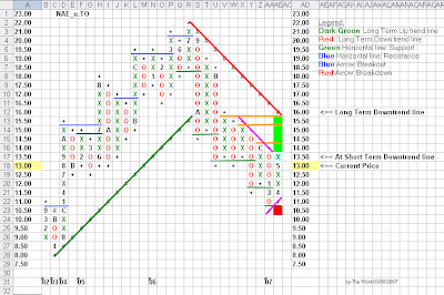
NAL is clearly in a long term downtrend as shown by the red downtrend line. In April 2007, it reversed into a column of X establishing a support at $11.00 and a short term uptrend line (purple 45 degree angle line). It traded up to $13.50 and then backed down to the current price of $13.00.

From here, the price objective is a return to the downtrend line at $16.00 and it needs three resistance breakouts to get there (horizontal orange lines). The risk is a break of support at $11.00 to the red square of $10.50.

If this evaluation is correct, we have a return of $16.00 - $13.00 = $3.00 on a risk of $13.00 - $10.50 = $2.50 or a ratio of 1.2 to 1.


On the surface, the return to risk ratio does not appear that great, especially given that I require a minimum of 2 for 1 and prefer a ratio in the 3 to 1. I will address this problem when I discuss the trading tactics later on. But first, I want to evaluate the “fundamentals” of the company.

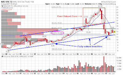
For this I use a long term monthly chart of all the securities that I follow. I believe that the long term trend line of prices is a good approximation of a companies’ growth rate over the cycle. Above this trend line I draw a parallel trend line in order to create a channel where most market prices should trade. There are times when a stock gets overvalued (see the over valued zone in red) and times when it comes back to the growth line (we are there now). My $16 price target appears conservative as it is within the expected trading band.


Finally, I also use the Fibonacci tool to evaluate the critical support level following any major correction (purple oval = $12.18).

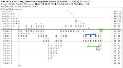
The second factor that I consider important is that a stock must have a relative performance better than that of the market. In order to evaluate that, I also use a P and F chart of the stock divided by the TSX index. The number therefore means absolutely nothing. There are two things that one must monitor with relative strength:


-1- Is the relative strength in a column of O or a column of X. NAE.TO = X
-2- What was the last event a breakdown or breakout? NAE.TO = Breakout

NAL Oil and Gas is therefore one of the rare income trust that I follow with a Breakout in a column of X.

The Trade

Converting a longer term plan into a trade becomes somewhat of an art and it always requires the identification of a stop loss if you are wrong in your assessment of the trade.

The art part is a function of the tools you use. It can be a screening system or a set of indicators which you monitor in order to time the trade to the best of your ability. I personally use the combination of an oscillator, volume indicator, and a non conventional convergence divergence indicator on different time frames as a confirmation for a trade.

In order to determine the right stop loss, I use a P and F chart with a 25 cents box size which I feel is more appropriate to the shorter term horizon of a trade. The chart below looks at NAL from that perspective.

Notice that the price column now increases by $0.25. Notice also that the resistance and support levels are different. Buying at $13.00 puts me in the middle of a trading range limited by support at $12.50 (green horizontal line) and resistance at $13.50 (purple horizontal line). The logical stop loss point on this trade is just below support at $12.25 (orange square).

So we now have a return of $16.00 - $13.00 = $3.00 on a risk of $13.00 - $12.25 = $0.75 or a ratio of 4 to 1.

If I hold this stock for one year, I will get a 14%+ return as income plus any variation from the price of the security in the marketplace.

An investor might evaluate his risk differently by evaluating the 0% return price which on this trade is around $11.00. That’s the price where, for the year, the total return would be $0 ( Price – Dividend or $13.00 - $1.92).

The Word
Therealword@gmail.com

Tuesday, August 7, 2007

Income Trusts – NAL Oil and Gas – Part I.

In turbulent times, investors have a propensity to avoid volatility and find the security of assets which exhibit lower price fluctuations. In times of uncertainty, investors become more risk adverse and move from greed to prudence. Fear comes later at market cross points.

Speculators and traders just love volatility because it provides opportunities for large gains in a very short period of time. The Market’s evaluation of risk quickly moves “on the other side” and soon enough the prevalent short term market trend becomes expensive. For example, if you were looking to short using puts today, you would find the premium quite expensive. When the trend was bullish, they were giving them away…

As I write this, it is clear to me that the long term trend is still bullish and the short term trend is bearish. As a general rule, I do not short a long term bull market. There will be a lot of opportunities later if the larger trend does reverses. But I do time the market in the sense that I did take my profits when it was clear to me that the market psychology was reversing. I showed some of the indicators I watch in previous posts. As markets correct, I transform into a different being. From a short term trader, I become more and more an investor with a longer investment time horizon with plenty of cash to re-invest when the time is right.

Having taken profits, I was then confronted with the question of where do I park my money? Cash currently yield 4.75% at my broker. Once I give the governments its share, there is not much left. If this is a correction, (and that is all I can assume right now) why not find high yielding securities whose correlation with the market is low and whose market price is at more attractive valuation levels. Income Trusts may fit the bill.

But there are a lot of risks to Income Trusts. I will highlight a few of them:

-1- Liquidity risk – These companies do not trade many shares during a day. For example, NAE.TO has traded an average of 230,000 a day over the past 60 days which is good. But many trade below 40,000 shares a day…
-2- Small capitalization risk – Being small, they will tend to be influenced by what happens to smaller cap stocks. It also means that institutions might avoid owning these stocks. As an example, there are 49 institutions which hold about 2.1% of the shares outstanding at NAE.TO. A corollary is that if institutions do no hold the stock, then the sell side research will be low to inexistent. There is currently no broker covering NAE.TO for example (coverage: provide an earning estimate). There lies an opportunity. If you can do your own research, you might have an edge before the crowd discovers a situation.
-3- Commodity and Currency risk – Many will experience financial results dependant on the price of commodities like natural gas, oil , iron ore and so on. As most commodity are priced in $US, they will experience exchange rate risk as well. For example, the rise of the $CDN has been detrimental to revenue growth, cash flows and earnings this year.
-4- Government Intervention risk – Income trust generate distributions (dividends) to their shareholders which are in a form of deferred capital gains, dividends and interests for a taxation purpose. Halloween 2006 was a day when the Federal government decided to change the rules of the game, and income trusts crashed and have been weak ever since.
-5- Economic and cyclicality risk – All companies are sensitive to contractions and expansions in economic activity. Income trusts are not immune.
-6- Stock market risk – When markets are in bear mode, all stocks are affected by the tide.

Many Income trusts will be reporting earnings between August 7 and 9, 2007. You can expect fireworks near the end of the week. Although, I see an opportunity in natural gas in the foreseeable future, it would be unwise to make any commitment before one has had a chance to evaluate the impact of the 2nd quarter on the various investment opportunities.
As a general rule, I find it too dangerous to purchase positions before a company has released their statement during earnings season. So what am I to do?

NAL Oil and Gas released their earnings report last week and it was generally quite good. Fundamentally, it has a good balance sheet, a low payout ratio (pays a low % of cash flows as dividend). On an annual basis, it pays $1.92 on a market price of $13.09. That’s a current yield of 14.67%. Usually that is a yield level associated with companies which are in trouble and where the market estimates that the distribution may be cut in the future. But that’s not the case for NAL especially given their recent financial results. I believe the reason is that 100% of this trust’s distribution is taxable as interest income. If you give 50% to the government in taxes, that means the after tax return is more in the 7.3% in my pockets.

Full Disclosure: I own a position in NAE.TO and my position can change anytime without notice.

Absolute Price Chart


Relative Strength Chart


I leave you with two blank Point and Figure Chart of NAE.TO. Tomorrow, I will discuss the Plan, the strategy and tactics for this stock.

The Word
Therealword@gmail.com


Monday, August 6, 2007

Income Trusts – Addendum to Natural Gas

This is a follow-up to the “Investing in Canadian Securities – Consider Natural Gas” post of about a week ago. First of all, let’s make one thing very clear. I am not suggesting you should buy anything. I am only proposing that, if the circumstances are good for you, there might be a place in your portfolio for natural gas stocks some day, and if that is the case, look at the income trust asset class as a means to get there.

As an addendum to that previous post, I wanted to show you the price relationship between oil and natural gas. The chart below shows the ratio of the price of oil to that of the price of natural gas over the past 10 years. Based on that history, we can calculate that the average ratio was 8.5 times (the green horizontal dashed line). We can also calculate the standard deviation of that relationship (a statistical number which measures the volatility around the average) and project two numbers which will help us better understand the history. These numbers are the blue line at a ratio of 10.8 and the black line at around a ratio of 6. The science of statistics now allows me to say that 2/3 of the time, the ratio was between 6 and 10.8. It also means that 1/3 of the time, it was outside of that volatility band. Now look at where the ratio is currently, 12.63 times. It is a law of nature that the relationship will eventually “revert back to the mean” and could even drop back below the black line as it did in 2001 2003 and 2006.


The probabilities for a return to the mean are quite high. It’s only a question of time. We just don’t know how we are going to get there. We can build different scenarios:

-1- The price of Oil drop precipitously and the price of Natural Gas is stable or up
-2- Or the price of Oil stabilizes and the price of Natural Gas rises.
-3- Or the price of Oil keeps rising but the price of Natural Gas rises even more.
-4- Or …
On the one hand, if you believe that generally oil service stocks in the US lead the price of oil, then the following chart suggests that oil may go down.


One the other hand, the US Oil fund is at a critical stage, smack on its long term downtrend line (S-18). Will we have a breakout or will that be too much resistance (remember, the pro usually start selling short right at the downtrend line)?


Nothing changed with Natural Gas prices this week, so there is not need to update the charts.

However, if we look at a monthly chart of Natural Gas and Oil, as many fundamental analyst might postulate, it is in our rights to assume that the price of a commodity follows its long term growth rate in consumption, subject to some cyclicality due to seasons, weather, brightness of the moon (?!) and so on.

If we draw a long term trend line as shown below, and then a parallel line above which contains most of the price action (the art part of technical analysis), besides finding patterns, we can evaluate the position of the current price with respect to the long term growth rate.
I will let you draw your own conclusions.

Natural Gas


Oil


Finally, I have drawn the Fibonacci retracement lines if only to confirm a point. The standard interpretation of these lines goes like this follows.

When prices correct, they usually move down to the minimum 38% line. Most of the time however, price move down by about 50% of the previous up move (the $51.03 December 07 was slightly above the $48.49 projection for Oil). Finally, the 62% price line is generally considered as the “make or break” line. It is the ultimate support line. If that breaks, then it is expected the stock/commodity will continue downwards towards the initial price ($17.12) or a 100% correction which then puts in jeopardy the trend because the previous low may be violated.

The lines are a nice tool to use. However it must be used with a grain of salt. For example, does anyone believe Natural Gas could go back to the summer 2001 low of $1.88? I just don’t think so. But there again, I did not use the Fibonacci retracement lines as prescribed by pure technical analysis doctrine. I cheated a little bit. Do you know why?

The Word
Therealword@gmail.com

Sunday, August 5, 2007

The Canadian market – Week in Review 30

Last week, the TSX composite had just broken down below support at 13,750 and was in a column of O after consolidating in a trading range between 14,000 and 13,750.

This week, it bounced off support at 13,550 (purple line & arrows) which was the previous June 27 low, and established a brief column of X before closing the week with a new column of O at 13,565.24.


Evaluation: This is the last significant support level before it reaches the long term bull trend line at 13,400. A break to 13,500 (orange square) would give us a target of 13,400 and a break to 13,350 (red square) would allow us to declare a new bear market. The support level at 13,350 (purple line), the May 1st level, is no longer relevant because the long term bull trend line prevails. Note that the rising 200 day moving average is currently at 13,277.47, a level which is lower than the trend line…! The bulls need to return to the game soon, or the game will be over.

The TSE Bullish % gave a serious warning when it crossed the 70 level downward and established a new column of O. This was a signal to change our strategy from capital appreciation to capital preservation. It gave a second signal when support at 60% was broken (red square with an 8 inside). This is a preliminary sell signal suggesting raising additional cash or hedging your portfolio.


Evaluation: We now stand at 54% which happens to be a previous resistance zone. Sometimes a previous resistance becomes a support. We shall see. The next significant area to watch is now the 50% level. Moving below with the TSX composite breaking the long term trend line would confirm that the trend has changed to a bear.

Nowhere to hide.
We present below, an evaluation of all the sectors of the Canadian market. Columns E to H evaluate the absolute trend for each sector:

-1- Health care is in a bear trend
-2- Consumer Staple, Technology and Utilities are in a bull trend and still rising (in a column of X).
-3- All other sectors are in a bull trend, and correcting (in a column of O).


Columns I to K evaluate the relative strength for each sector. In the legend below we sorted the different conditions by providing a score from +2 to -2.

-1- There are only two sectors with a Buy in a column of X or a score of +2. They are Consumer Discretionary and Materials.
-2- We have one sector with a Buy in a column of O or a score of +1, Industrials.
-3- All other sectors have rolled over with the worst score, -2, not very encouraging…

What precipitated the “correction” in the US is the relative weakness of small cap stocks in that market. The Russell 2000 index broke its long term uptrend line in July after a double top at 855 and is now trading at 755. Looking at the Canadian MidCap and SmallCap markets, we do not have the same situation.


The TSX MidCap is still in an uptrend. There have been two consecutive sell signals (red squares) since it reached a top of 975. The first potential support is the old resistance zone where a breakout occurred at 900 (orange zone). After that we have support at 870 (purple line and arrows) and then the uptrend line at 860.


The TSX SmallCap is much closer to its long term uptrend line of 750. Also, there are no significant support levels before we reach that trend line. All we have are 2 previous resistance levels which may act as support. We shall see…

In conclusion, I hope this review of the Canadian market from a Point & Figure perspective will complement the information you typically use to make up your mind on the future course of the market. That is the only objective.

The Word
therealword@gmail.com

Friday, August 3, 2007

Panic?

Here is Cramers take, one thing for sure, he is passionate.

Meanwhile, back at the ranch, the stocks I (Another Brian) purchased (TSX) on Monday July 30, NEM, TKO, QUA, EQN, are holding up pretty good with all this panic going around.

For another look at where the market sits, visit Stockbee and check out his market monitor.

Thanks to "The Word" for his recent posts.

Income Trusts – Suggested week-end reading.

Next week I intend to start covering Canadian income trusts. However, I will assume you know the basics and so here are my suggested readings for the week-end:


-1- A quick primer can be found here at Wikipedia


-2- Here is a free web site which does a good job of covering income trusts.


-3- And finally, a list of income trusts which are part of the TSX income trusts index.


For each stock in the index, you will have access to some very interesting fundamental information. My favorites are:


(a) The company’s profile


(b) News


(c) Insider’s trading – late but still useful.


(d) … and for entertainment only the forum…


NAL Oil and Gas gave a good quarterly report a few days ago. I intend to start with this trust next week.

Full Disclosure: I bought an initial position today and my position can change anytime without notice.

A very well known technical analyst (he appears on ROBtv from time to time) once said on his web site that income trusts cannot be evaluated technically because of their high yield. I totally disagree with that statement and intent to demonstrate the opposite view over the course of the next few months.

Using technical analysis alone is not enough. At the very least, you need to follow the fundamentals of any company you are considering investing in. Many people only use one or the other. My training has taught me to use both.

The Word
Therealword@gmail.com

Disclaimer

The information presented on this site is for educational and entertainment purposes only. This site contains no suggestions or instructions that you must follow, do your own research and due diligence before committing your cash to the markets. Your on your own.