In this post, I'll discuss the USDCAD tops formed in 2008 and 2009. Before I set out to trade any pair or instrument using this method as defined by Sam, I examine the chart, all the evidence is there for you in history. Some forex pairs I just don't trade because I can't see many areas where price respected supply and demand as Sam explains it.
Before I get into this, I want to say that I wasn't much of a trader in 2008, my methods were different, and I never traded any of these tops. It is also easy to go back and say would have, could have, but you can learn from the set-ups from the past. They are not hard to spot if you go back and look at charts, scroll forward and see if it would have worked out for you. Write down winners and loser and approximate pips. Do some quick rough back testing to see if it works for you, or how good you are at picking levels.
Let’s take a look at the USDCAD chart. Here is a global view of the tops I'm looking at, label Top 1 to Top 4. The difference between all the highs is only 80 pips, as shown on the daily chart. Using the daily or weekly we can see some obvious tops. These are not low volatility moves, mistakes, intraday hiccups, or noise. The chart below is daily bars so there are lots of trades in each bar. The difference between the 4 highs shown in yellow is only 80 pips. Look at the rejection of top 3, price just went screaming away from 1.3000, that tells me lots of traders were prepared to take that trade. Top 3 sped away the fastest but to be honest, the first three tops all screamed away from 1.3000 quickly. When I say quickly, don’t get excited like we are racing cars here. Look at the zoom shots of the chart, count the bars. It takes time for price to move – this is the patience factor. Once you place the trade, walk away because it’s like watching paint dry. The only time I watch the chart is when I day trade ES or currency futures on my Interactive Brokers account.
The first 3 tops actually looks like an ascending triangle, and this is “supposed” to break to the upside! Well it didn’t. So much for the breakout trade. A failed breakout is sometimes a bull trap! Look at top 4 for that! The highest of all and falls away very quickly.
Top 1, 2, 3 and 4 (below)
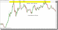
The black lines are the highs, the top most and bottom most high. The blue line is 1.3000.
Top 1 - Initial move almost exactly to the huge round number of 1.3000. Wait for the reaction at 1.3000. Price almost always will re-visit the area where it turned and shot away. When it did re-visit the area, 16 hours later, look where it stopped and turned. Right where Sam tells you the "zone" is located. Price didn't penetrate that zone very far. The zone in Top 1 is shown with the red rectangle. Remember, next time price gets back here, it will most likely go a bit deeper into the "zone". If you didn't catch this trade, remember to watch price later if and when it does get here. The only reason to take this trade would have been for a bounce off 1.3000, or the re-test of this area 16 hours later. Price was in an up trend so the 16 hour re-test would have been a low risk trade, probably seen by those watching the 1 or 4 hour time frame.
Top 1 (below)
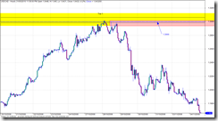
Top 1 and 2 - Zooming in on top 1 and top 2 on an hourly chart to see what the tops look like up close. Both times price spent between 1 and 4 hours in the area, so it took some time for the orders to work and process until the price eventually dropped. Top 1 you can see a quick drop, quick as in it took hours of red candles before retracing. The retrace went right into the sweat spot to short (Sam Seiden Supply and Demand). This could have been a low risk entry, but you wouldn’t have known that this would be the turning point. The only thing s you had to go on were the huge round number of 1.3000 and the supply area (red box). But it offered a low risk entry with a stop just above the previous top hours earlier.
Top 1 and 2 (below)
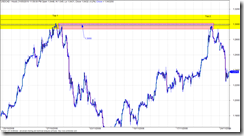
Top 2 - (below) came right up into the sweet spot for the short. You should have seen this coming weeks in advance, and placed a limit (pending) order. It’s entries like this that I would lean hard on the risk, I typically do a 2% risk but when the planets all line up I’ll crank it up to 5% or 10%. Read about the Kelly calculation to get an idea of the max risk you should trade, I will max out at 10% or 20% Kelly.
Top 2 (below)
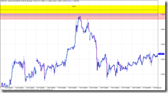
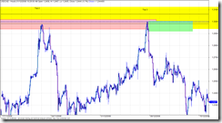
Top 2 and 3 – Top 2 has already depleted some of the order from Top 1, so as price approaches you should be thinking that price might go deeper into the zone to take out some of the orders.Top 3 did go deeper into the zone, and there must have been traders waiting because it was sent screaming away.
Top 2 and 3 (below)
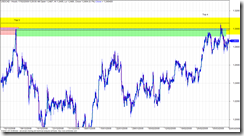
Top 3 and 4 – Why did Top 4 penetrate Top 3 if Top 3 was so powerful at sending price back down? Well Top 4 penetrated the level even more, it actually made a new high. Ever notice how price breaks out like that? I bet you do, everyone gets burned like that looking for the breakout. Well, the way the experts explain it is like this…. Top 4 penetrates even deeper, hen makes a new high. Break out traders are waiting and jump in but there are not enough of them to push price past all the experts waiting for the breakout traders. They jump in with lots of cash and drive price down. There are no willing buyers to keep it going, it’s “overbought” or just plain to much for the big money to pay, they don’t pay retail. This sounds like a good explanation but it really doesn’t matter, all you need to remember is the third or fourth test could go either way so keep you stop close by so you don’t get hammered. Nobody knows which way it will go.
Top 3 and 4 (below)
What did we learn?
When you watch football, where is the “line” on the filed that makes you almost sure something is about to happen on the score board? The goal line. So if you could get the same odds for a bet on the next play to be a touchdown, would you bet when the ball was on the 30 yard line or the 1 yard line? Wait for price to get to the goal line. And understand what makes price move – it’s not a bunch of candles that all line up, look for where the order sit, price move from these areas in a big way. Memorise the odds enhancers. Search with Google until you find the odds enhancer file, one document that is pretty good is called “BS Trading”.
The lesson here, or what you need to take away is that you can figure about how to trade simply by using the data you already have. Look for obvious turning points, circle them and make notes. Study the chart. Remember that longer term charts are more reliable. Inside of 1 hour is choppy and sometimes unpredictable so don’t use it to study. If you want to scalp under 1 hour go for it, but make sure there is movement and your doing it when at least two markets (up to 11am EST) are open. I look at the daily then zoom into the 4 hour for a better look, sometimes I use the 1 hour for a closer look but I don’t use the 1 hour to study.
Use your software playback feature or the function key that lets you advance a bar at a time. You might also notice differences between pairs. The EURUSD seems to work well with supply and demand, but some others like CHF are all over the place and I have yet to find and rhythm, rhyme, or reason for how it behaves so I generally stay away from it.
Try out the trading games on the net, I posted about that earlier.
If you want to know more about Sam Seiden, look at Trading Academy or Fxstreet.com for recorded webinars.
Before I get into this, I want to say that I wasn't much of a trader in 2008, my methods were different, and I never traded any of these tops. It is also easy to go back and say would have, could have, but you can learn from the set-ups from the past. They are not hard to spot if you go back and look at charts, scroll forward and see if it would have worked out for you. Write down winners and loser and approximate pips. Do some quick rough back testing to see if it works for you, or how good you are at picking levels.
Let’s take a look at the USDCAD chart. Here is a global view of the tops I'm looking at, label Top 1 to Top 4. The difference between all the highs is only 80 pips, as shown on the daily chart. Using the daily or weekly we can see some obvious tops. These are not low volatility moves, mistakes, intraday hiccups, or noise. The chart below is daily bars so there are lots of trades in each bar. The difference between the 4 highs shown in yellow is only 80 pips. Look at the rejection of top 3, price just went screaming away from 1.3000, that tells me lots of traders were prepared to take that trade. Top 3 sped away the fastest but to be honest, the first three tops all screamed away from 1.3000 quickly. When I say quickly, don’t get excited like we are racing cars here. Look at the zoom shots of the chart, count the bars. It takes time for price to move – this is the patience factor. Once you place the trade, walk away because it’s like watching paint dry. The only time I watch the chart is when I day trade ES or currency futures on my Interactive Brokers account.
The first 3 tops actually looks like an ascending triangle, and this is “supposed” to break to the upside! Well it didn’t. So much for the breakout trade. A failed breakout is sometimes a bull trap! Look at top 4 for that! The highest of all and falls away very quickly.
Top 1, 2, 3 and 4 (below)

The black lines are the highs, the top most and bottom most high. The blue line is 1.3000.
Top 1 - Initial move almost exactly to the huge round number of 1.3000. Wait for the reaction at 1.3000. Price almost always will re-visit the area where it turned and shot away. When it did re-visit the area, 16 hours later, look where it stopped and turned. Right where Sam tells you the "zone" is located. Price didn't penetrate that zone very far. The zone in Top 1 is shown with the red rectangle. Remember, next time price gets back here, it will most likely go a bit deeper into the "zone". If you didn't catch this trade, remember to watch price later if and when it does get here. The only reason to take this trade would have been for a bounce off 1.3000, or the re-test of this area 16 hours later. Price was in an up trend so the 16 hour re-test would have been a low risk trade, probably seen by those watching the 1 or 4 hour time frame.
Top 1 (below)

Top 1 and 2 - Zooming in on top 1 and top 2 on an hourly chart to see what the tops look like up close. Both times price spent between 1 and 4 hours in the area, so it took some time for the orders to work and process until the price eventually dropped. Top 1 you can see a quick drop, quick as in it took hours of red candles before retracing. The retrace went right into the sweat spot to short (Sam Seiden Supply and Demand). This could have been a low risk entry, but you wouldn’t have known that this would be the turning point. The only thing s you had to go on were the huge round number of 1.3000 and the supply area (red box). But it offered a low risk entry with a stop just above the previous top hours earlier.
Top 1 and 2 (below)

Top 2 - (below) came right up into the sweet spot for the short. You should have seen this coming weeks in advance, and placed a limit (pending) order. It’s entries like this that I would lean hard on the risk, I typically do a 2% risk but when the planets all line up I’ll crank it up to 5% or 10%. Read about the Kelly calculation to get an idea of the max risk you should trade, I will max out at 10% or 20% Kelly.
Top 2 (below)

Top 2 and 3 – Top 2 has already depleted some of the order from Top 1, so as price approaches you should be thinking that price might go deeper into the zone to take out some of the orders.Top 3 did go deeper into the zone, and there must have been traders waiting because it was sent screaming away.
Top 2 and 3 (below)

Top 3 and 4 – Why did Top 4 penetrate Top 3 if Top 3 was so powerful at sending price back down? Well Top 4 penetrated the level even more, it actually made a new high. Ever notice how price breaks out like that? I bet you do, everyone gets burned like that looking for the breakout. Well, the way the experts explain it is like this…. Top 4 penetrates even deeper, hen makes a new high. Break out traders are waiting and jump in but there are not enough of them to push price past all the experts waiting for the breakout traders. They jump in with lots of cash and drive price down. There are no willing buyers to keep it going, it’s “overbought” or just plain to much for the big money to pay, they don’t pay retail. This sounds like a good explanation but it really doesn’t matter, all you need to remember is the third or fourth test could go either way so keep you stop close by so you don’t get hammered. Nobody knows which way it will go.
Top 3 and 4 (below)

What did we learn?
When you watch football, where is the “line” on the filed that makes you almost sure something is about to happen on the score board? The goal line. So if you could get the same odds for a bet on the next play to be a touchdown, would you bet when the ball was on the 30 yard line or the 1 yard line? Wait for price to get to the goal line. And understand what makes price move – it’s not a bunch of candles that all line up, look for where the order sit, price move from these areas in a big way. Memorise the odds enhancers. Search with Google until you find the odds enhancer file, one document that is pretty good is called “BS Trading”.
The lesson here, or what you need to take away is that you can figure about how to trade simply by using the data you already have. Look for obvious turning points, circle them and make notes. Study the chart. Remember that longer term charts are more reliable. Inside of 1 hour is choppy and sometimes unpredictable so don’t use it to study. If you want to scalp under 1 hour go for it, but make sure there is movement and your doing it when at least two markets (up to 11am EST) are open. I look at the daily then zoom into the 4 hour for a better look, sometimes I use the 1 hour for a closer look but I don’t use the 1 hour to study.
Use your software playback feature or the function key that lets you advance a bar at a time. You might also notice differences between pairs. The EURUSD seems to work well with supply and demand, but some others like CHF are all over the place and I have yet to find and rhythm, rhyme, or reason for how it behaves so I generally stay away from it.
Try out the trading games on the net, I posted about that earlier.
If you want to know more about Sam Seiden, look at Trading Academy or Fxstreet.com for recorded webinars.


